| Menu |
|
Main • Index Browse • Screenshots • Old News Submit • Screenshot • News Discuss • Forums |
| Search |
| Styles Packs |
| Download all 2693 styles upload to the site as of 08 February 2020! |
| Links |
Windows Shells   *nix Window Managers Blackbox FluxBox Styles NC-17 Pitkon To Us  |
| « Next | Homecoming by roninblade65 | Prev » | ||
 |
User | roninblade65 |
| Notes | ||
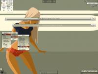
| This I based off the WP i got off of DeviantArt. Kinda made me think of a girl waiting at the docks/airport for her lover to come back from a war. Maybe its the green, kinda reminds me of military colors back when i was in boot camp. Anyway, my biggest question mark is the highlites - I used the colors from her shirt and shorts for contrast but i cna't make up my mind if I like them or not. | ||
| Shell | BBLC\BBLean | |
| Style | Homecoming | |
| Wallpaper | Hotpants | |
| Comments | |
| Inauro | Actually, i think you've picked a good colour range for the highlights. Perhaps trying a different gradient might make them appear a little less muddled though. You look to be using a horizontal gradient, why not try a flat vertical or something? Other than that, style looks great. |
| cthu1hu | IMO, to make the style look cohesive, you should only use a small number of colors, gradients and bevel types among all the elements. Maybe bout 3 types total. Like using the window title for the titlebar, the focused window label for the menu title, etc.. But that's just me, and I'm no expert. |
| Nightbreed | I see what he went for here, the color styles he used matches the color elements in the picture. Including the highlight in the menu, that to match the color of the shirt and shorts. All in all the colors in my opinion works with the desktop. |
|
© 2003-2006, Brian "Tres`ni" Hartvigsen, Jesterace, snkmchnb and NC-17 Styles © of their respective authors Please direct all administrative questions/comments to Jesterace, snkmchnb or NC-17 |
| Random Screenshot |
 ‡ • Nightbreed • 17 |
| Style Switcher |
 • •
 • •
  • •
 • •

|
| Chatbox |
| Valid BBCode: [b][u][i][url] |
|
NitroGliser 2026-05-01 04:10 yo folk, some NSFW themes or balkanish serbian vibe? patm 2026-02-03 01:07 I love that this is still here, remeber handing out in irc for this and litestep, almost 30 years ago now r-i 2025-12-11 13:31 greetz from cy-x.net where'd the forum go? snkmchnb 2025-11-21 23:09 I really need to go back and redo some of the styles from when I first started. zerrrg 2025-11-20 07:06 Wow holy crap, all this still exists. I haven't been on this site in forever. I'm glad to see blackbox, and all the other *box window managers and styles and stuff are still out there. So cool. Hi everyone! antehex 2025-10-16 12:05 also, another question, how do i search with the windows ui? not with blackbox or sum antehex 2025-10-16 11:55 hey guys how do i customize the layout of my menus n things pretty boring having my "taskbar" at the top mogof 2025-10-11 09:27 how to apply this? light 2025-10-10 00:46 it uses 1% of cpu !!! one Megabyte !!!!!!!!!! bb4win1 2025-08-16 16:11 The fact that this is all up and still running is remarkable. Can't wait to try this on my pc |
| Chatbox History |