| Menu |
|
Main • Index Browse • Screenshots • Old News Submit • Screenshot • News Discuss • Forums |
| Search |
| Styles Packs |
| Download all 2693 styles upload to the site as of 08 February 2020! |
| Links |
Windows Shells   *nix Window Managers Blackbox FluxBox Styles NC-17 Pitkon To Us  |
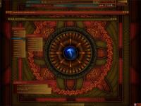
| « Next | Palantir_gold by clovemagic | Prev » | ||
 |
User | clovemagic |
| Notes | ||
| I love this wallpaper. I've created at least four different versions of this style. This one is my favorite. | ||
| Shell | BBLC\BBLean | |
| Style | ||
| Wallpaper | Palantir by vlad of vladstuidio.com | |
| Comments | |
| thewayofzen | soo much potential for a great style here but i have no idea how you can read that font.. great color choices but just unreadable. |
| clovemagic | zen: yeah, it's not the easiest font to read. I really wanted to use a font that reflected the spirit of the wall. I couldn't find a better alternative. Do you have any suggestions? |
| thewayofzen | dude im a lazy ass and i just use the font pack.. i totally dug the colors though.. i hope i didnt sound harsh. my apologies if i did. |
| clovemagic | No worries, zen. I welcome constructive criticism. Btw, if "dude" is meant as an address, "dudesse" or "dudette" might be more accurate. I personally prefer "High Priestess Dude" or "Empress Dude of the Universe." ;P |
| clovemagic | No worries, zen. I welcome constructive criticism. Btw, if "dude" is meant as an address, "dudesse" or "dudette" might be more accurate. I personally prefer "High Priestess Dude" or "Empress Dude of the Universe." ;P |
| el capitan | beautiful style, but i have to agree with zen on that font there... also a little iffy with all that extra padding around it. nevertheless good style and nice to see a few different colors for a change :) |
| thewayofzen | shoot .. again im sorry. there are so very few girls in the communitfy. forgive me.. "high priestess dude" ;) |
| clovemagic | zen: With the power vested in me, I pronounce you forgiven. LOL :D |
| Sven | Ooh, pretty. the wall seems a bit overloaded though, it's got that "where should i look?"-effect :| => nice to look at, but a productivity stopper :/ |
|
© 2003-2006, Brian "Tres`ni" Hartvigsen, Jesterace, snkmchnb and NC-17 Styles © of their respective authors Please direct all administrative questions/comments to Jesterace, snkmchnb or NC-17 |
| Random Screenshot |
 ‡ • thewayofzen • 11 |
| Style Switcher |
 • •
 • •
  • •
 • •

|
| Chatbox |
| Valid BBCode: [b][u][i][url] |
|
NitroGliser 2026-05-01 04:10 yo folk, some NSFW themes or balkanish serbian vibe? patm 2026-02-03 01:07 I love that this is still here, remeber handing out in irc for this and litestep, almost 30 years ago now r-i 2025-12-11 13:31 greetz from cy-x.net where'd the forum go? snkmchnb 2025-11-21 23:09 I really need to go back and redo some of the styles from when I first started. zerrrg 2025-11-20 07:06 Wow holy crap, all this still exists. I haven't been on this site in forever. I'm glad to see blackbox, and all the other *box window managers and styles and stuff are still out there. So cool. Hi everyone! antehex 2025-10-16 12:05 also, another question, how do i search with the windows ui? not with blackbox or sum antehex 2025-10-16 11:55 hey guys how do i customize the layout of my menus n things pretty boring having my "taskbar" at the top mogof 2025-10-11 09:27 how to apply this? light 2025-10-10 00:46 it uses 1% of cpu !!! one Megabyte !!!!!!!!!! bb4win1 2025-08-16 16:11 The fact that this is all up and still running is remarkable. Can't wait to try this on my pc |
| Chatbox History |